USER EXPERIENCE WORK
UX x CRO
ux audit for Percussion IQ
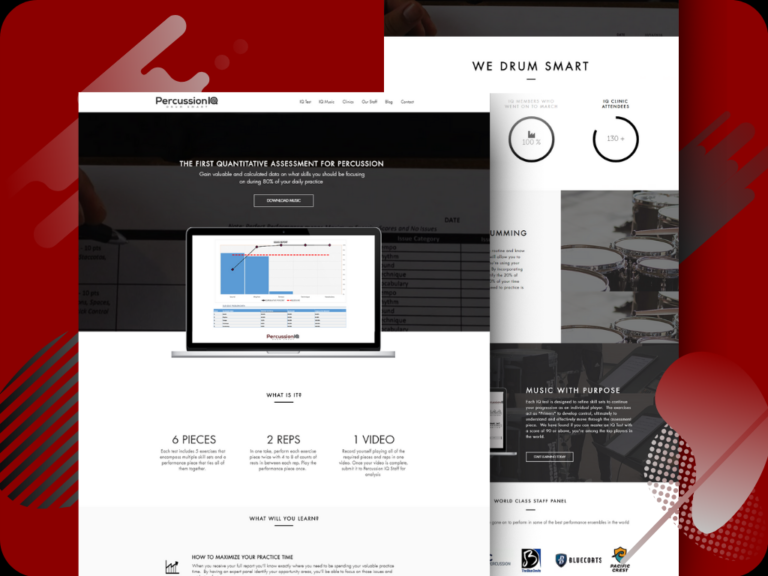
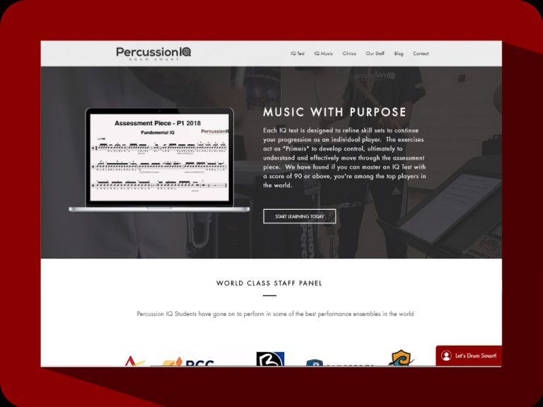
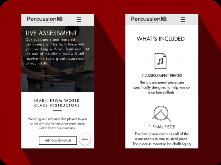
Percussion IQ is a marching percussion education organization based out of Scottsdale, Arizona. Back in August of 2017, I had the opportunity to redesign their website. The goal was to rework the user experience to boost the conversions on the site. I started with user research (both quantitative and qualitative) and used insights gained to design and structure content into a sleek, refined interface that increased the conversion rate and time per session for the site.
USER RESEARCH
Google Analytics and user surveys
I used user surveys and Google Analytics data to integrate user research into the process of redesign. While Google Analytics and Google Tag Manager gave me a quantitative overview of metrics like high bounce rates and exit pages, I needed qualitative data to back those measurements up with actionable insights. I conducted a user survey a small group of Percussion IQ followers to understand their user behavior and why certain pages were not performing.
NEW OBJECTIVES
The rework
Percussion IQ’s product is complex and the audience is niche, so the website, at the time, was heavily centered around informing the user about their product, the IQ Test. But my research showed that the majority of users already knew about Percussion IQ. This meant that the bulky amount of copy and the complex information architecture of the site was keeping them from getting to a conversion quickly. As I began a redesign, I put an emphasis on shortening that journey while keeping the information architecture intuitive for newer users.

HOW IT WENT
The results
+138%
Increase of conversions
-32%
Decrease of bounce rate
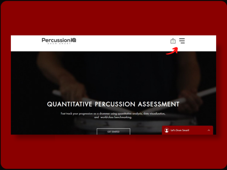
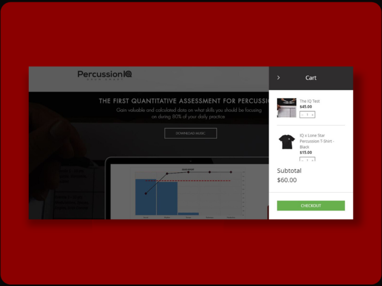
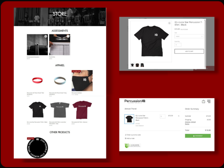
ECOMMERCE UX BUILDOUT
Yeah, I already changed it
The original site was built to sell Percussion IQ’s centerpiece product, the IQ Test. Recently, they invested in a new line of apparel and need the site store to be built out. I took this as a chance to rework the site’s broader UX to place a greater weight on the store and to minimize the user’s flow to a conversion. Take a look at this project below and click on any of the slides to learn more about each screen.

